
mobile trip planner
Travelling around the world has brought so much joy to my life. Travel has taught me to be adaptable, curious and it has enriched my life giving me memories that will last a lifetime. Yet at some point or another, we have all had to sit down and book that trip. And even though we are anticipating the fun times ahead, booking flights, accommodation and transfers can leave us feeling stressed and confused.
Recently I had the opportunity to combine my love of travel and UX design working on a project with Rome2rio to help make travel planning easier.
About:
Rome2rio makes travel planning easy. With door-to-door travel information and booking engine, it helps travellers get to and from any location in the world.
By entering any address, landmark, or city as the destination, the app will instantly display the users travel and booking options, together with information about accommodation and things to do.
The app includes flight, train, bus, ferry, rideshare or rental car information, estimated prices, journey durations and booking details.
Brief:
To provide Rome2rio with recommendations and suggestions to improve the UX experience, specifically, to assist their users in getting to any location in the world.
Suggested deliverables:
-
Takeaways from user research and competitor analysis
-
Suggested features & design recommendations
-
Use cases & user stories
-
Prototypes (paper and interactive)
-
Presentation (30mins)
Responsibilities:
As part of this project I assumed the role of product manager along with designing and developing the clickable prototype.
Duration:
2 week sprint.
| Discovery
competitor analysis
I conducted a detailed competitor analysis of similar websites and applications that assist travellers with their travel needs.
The competitor analysis revealed that each competitor had one distinctive strength or emphasis, however none solved the problem of collating multiple trips and plans together to help a user view their entire multi-stop trip in one location.

While it does allow for multi-trip flight bookings, it is a time consuming process lacking an auto-generated system.
The only option is to search flights.
Unable to change order of itinerary.
With its focus on reviews and rating the function of the website helps the user build confidence in their choice through recommendations of trusted advisors.

When booking, it highlights both cost and travel time, allowing travellers to make informed decisions.
Able to make a direct booking that is held in a wallet.
Doesn't allow multi-trip travel plans


Has useful multi-stop function but this function lacks prominence and is hard for the user to locate.
Taking multiple steps to complete action.
This function doesn’t allow for multi functional travel systems.


The tracking of hotel bookings feature gives the user confidence that all nights are booked and helps the user identify where actions are missing.
Doesn't provide users with options to assist with their travel plans.


| Discovery
user research
To qualify as a user participants must meet one of the following criteria
1. Currently travelling in Europe and/or Japan
2.
Returned from travelling in Europe and/or Japan in the past six months
3.
Is travelling to Europe and/or Japan in the next six months
5
5

5 users multilingual
age group: 30 - 45yo
The discussion guide revolved around two central themes.
1.
How does our user build their itinerary?
2.
How does our user organise their travel itineraries?
|| Define
affinity mapping
I then conducted an affinity map methodology to uncover themes, motivators, behaviours and pain points for our users.
key findings
-
User research indicated that major flights are purchased first (entry and exit points) then internal transportation and hotels are arranged after — usually in sequential order of travel.
-
Users wanted to be able to create their own itinerary.
-
Users needed to be able to adjust their itinerary easily before they started booking.
-
Users had a basic idea about the locations that they wanted to visit and the order that they will visit them.
-
Users were happy to input itinerary information.
-
Users want to search, book and manage their itinerary within one site.
-
Users expressed a desire to save and see all flights, hotels and transportation information in one place.
-
Users found it helpful to receive alerts for upcoming flights and travel plans.
-
Users were looking for a system that would help them check all booking confirmations in sequential order.
-
Users needed to share their itineraries with their partner/family/friends easily.
-
Users need to be able to access their itinerary offline.
||| Development
problem statement
“How might we help people plan, book and manage their entire itinerary?”
solution statement
“The ability to search single, return and multiple location journeys will bring clarity to the management of people’s travel plans”

||| Development
persona

||| Development
prototyping and usability testing
A multiple stage approach to prototyping allowed us to pivot on ideas quickly, fail fast in early stages, leaving us with only minor changes during the final prototype.
paper prototyping

A Lean UX methodology "Crazy 8's" was used at the beginning of our prototyping. This design studio process allows the freedom to try new thing, present new ideas and test our user flows. At the end of this process we collectively combined our favourite ideas which would be taken forward for further development.
This fail fast method allowed us to quickly go through a number of iterations, checking the layout and perfecting the user flow.
Iteration allowed the team to compare and test different designs to identify the strengths and weaknesses of the prototypes.
The final paper prototyping was taken to the client so that we could get a sign off from the client.
low-medium prototyping
Clickable prototyping allowed quick iterations based on user testing. Testing that all new functions felt as natural as possible to the user.
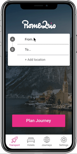
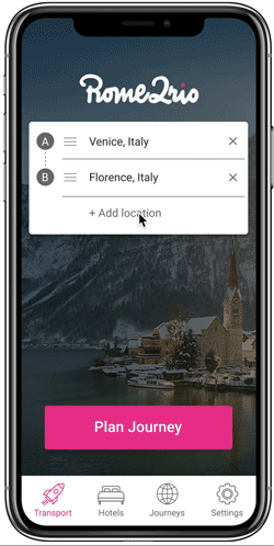
Search bars worked well and by adding the icons A and B improved user understanding that they could add their address.
Testing on the wording "location vs destination". Users understood location to work for any place that they wanted to go.
Change font tone to assist with colour contrast
Highlighting of icon verify the location of the user
Creating a new button didn't allow for a natural flow for the user. This added extra clicks to the process and caused confusion.
Highlight call to action button
Strong understanding of the icons used, adding text would assist further

Test wording of call to action button
|||| Deliver
1.
As a traveller I want to be able to plan a multi location journey so that I have all my travel information in one place.
Search function located in an intuitive location and format
The icon in the bottom navigation bar is highlighted to assist the user in knowing what pages they are looking at
Through using the X action the user has the ability to have a change of mind.
Predictive text to assist with finding a location and assistance with spelling.
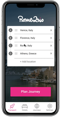
Have the option to drag and drop locations within your itinerary.
Predictive text added a secondary function to help first time users understand that they are able to put in a city, landmark, or an address.
It was important that during the search process the user remained on the one page. It assisted in clarifying where the user is up to.
Ability to see full itinerary in one place before hitting Plan Journey button
2.
As a traveller who is going to visit many places, I want to be able to see and compare my transport options in one place so that I don’t have to search one by one.
Ability to go back to the original search page
Image of the entire trip on a map
Itinerary broken up into small manageable trips
Arrow button used to suggest user can view more options

Option to save itinerary
Icons used for different travel methods
Name of the journey
Icons of all the different types of travel options methods. This makes for easy recognition
Each line provides the user with information on travel method, estimated time and price.

Recommended is a suggestion to the user that balances both price and time.
The user is linked to an option to purchase tickets or directed to the relevant provider
User research indicated a strong interest in highlighting different travel option.
1. Fastest
2. Cheapest


Next steps — for further development
-
AB testing of key buttons will help develop further content for the website.
-
To be able to access itineraries offline.
-
Further user research is needed to be able to organise all booking and itinerary information in one place.
-
Further research is needed to help users retrieve and add booking information that was made outside of the Rome2rio app.